‘The avatar’s function is as a representation of the user within the online environment. As such, the user instils the avatar with qualities they want to project into that environment.’ - implications of the sentence has allowed for the element of creating a sub-human, for example games such as World of Warcraft allow for the user to design his own personal ‘avatar’ there he can decide the race and class and customise it to suit his needs and project those into that environment. Following on, we may say Avatars are a form of language they operate as a sign system that can be read in semiotic terms. Not only are you creating your own new avatar with weapons that wouldn’t exist within reality you all so establish a personal form of communication with other avatars. For example it maybe the language you use or key in emotions such as smiley faces to identify who you are and establish some form of existence in that ‘world’.
Within that world or computer game, whatever it maybe the avatar is a visual representation of the user that enables participation within the online environment. As such, it is a social tool. We could say that Facebook is a visual representation of that user, i.e. you add in your favourite music, pictures and make status about what’s going on within your life which leads to enable some form of participation with other users using the same server. You have the ability to leave a comment or ‘like’ someone status, making communication within their profile. Saying that, the avatar you may create could necessarily not be a visual presentation of the real you. Avatars that take the forms of profile pictures (like on Facebook and MySpace) are like wearing your best clothes to non-uniform day at school: users want to present certain aspects of their personality (real, imagined or aspirational) to the society they interact with. You have the ability to change who you are, maybe elaborate on certain aspects of your personality to stand out and in away make a new identity.
At the same time, it provides a distancing device that turns person (user) into character (avatar). It is a fictionalising tool that creates a new reality. The symbol of the avatar (signifier) points to the signified (the user), creating a sign. Isn’t the purpose of the avatar to establish the real you? Or is it to be someone you couldn’t be? Avatars often revel in the gap between the signifier and the signified: Users enjoy creating avatars that are not like themselves, so that there is a big difference between signifier (avatar) and signified (user). Not all avatars are just computer game characters or social networking websites; an avatar acts as a calling card/ telephone number/ identification card etc, allowing other to find the user/avatar. We have access to the avatar via, mobiles and contacts, people publish their telephone number on Facebook and to find that avatar requires trailing through those other avatars such as their Facebook. Dannah Boyd says ‘Teens often fabricate key identifying information like name, age, and location to protect themselves’ – by this he means we can change our information, we can hide our identity and in away make ourselves oblivious.
We have to establish what is an avatar? It comes in many forms, from a computer character that is nothing unlike the user to a form of a different character providing a real ecological representation of that user. But yet we have the ability to customise who we are, we can change factors of our personality and make certain aspects stand out more, we have the ability to change who we are. This can be done through pictures or profile pictures or even the way other people communicate towards you. I wouldn’t necessarily follow that the avatar is a visual representation of the user, but instead a visual representation of what that user wants to be.
Wednesday, 24 November 2010
Tuesday, 2 November 2010
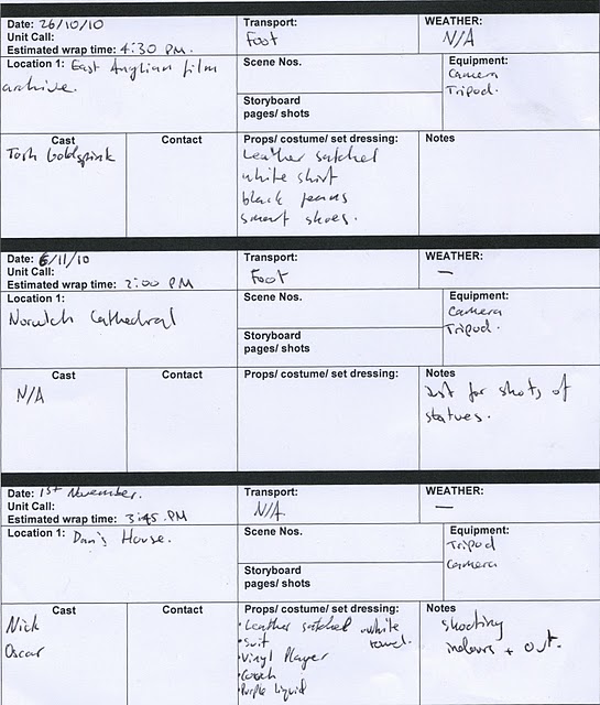
Costume and Props
 |
| When filming at the Archive we use a plain white shirt for our actor as he was playing the role of a employee who stumbles upon the film reel of Al Hubbard. The white shirt is a smart, yet simple design and with the sleeves rolled up it doesn't stand out to much but blends in well with the overall video. |
 |
| Once again some simple black trousers look well with a plain white shirt, it gives our actor a formal look and shows that he works there, it simple and blends in well with the film. |
 |
| Black shoes alongside with the white shirt and black trousers once again gives of a formal appeal. We chose this certain pair of shoes as it gives of a 'tapping' sound when he walks along the corridor to add some sound effect to our video. |
 |
| A brown leather satchal is ideal for sneaking our film reel inside, it's dated and not modern and gives a much better affect than say a modern 'addidas' bag. |
 |
| The project was one of the key elements when filming inside the archive as this is were our actor places the reel of Al Hubbard and the story commences. |
 |
| This is the film reel telling the life of Al Hubbard which is one of the key elemetns when telling the story of Al Hubbard. |

Monday, 1 November 2010
Analysis of the audiences
Black Moth Super Rainbow
Formed in Pittsburgh, USA, Black Moth Super Rainbow is well known for their distinctive experimental sound. There are many hidden genres of sound within their music, it is hard to define just what kind of music they really are, they range from folk, to elements of the psychedelic sound to electronic.
Once again Black Moth Super Rainbow target audience are similar to those of The Doors, a new generation of psychedelic hippy trippy people. Except this time they’ve attracted a new target audience, they’ve bought the younger generation of people, people my age out of the shadows and into the light. People make a connection to their music, but it’s not just the sound they play but the in depth meaning to each song they play. Younger Generation of people seem to be making more of an interaction to new songs out their, instead of just listening to the music, they relate to the artist and find out about history of the band.
Our production can learn a lot from this band, maybe we could bring in a new type of audience? Instead of aiming for one genre of people, why not that one genre of people of different ages, old and young.

This is some of Black Moth Super Rainbow artwork. Looking at the image we can see the sort of genre the artist is and what the picture is trying to connote. The psychedelia appeal really attracts my attention to the sort of thing I want to create for my digipak. The abstract imagery used, the man with a tree for a head shows what impression the artist is giving off. Underneath we have a sub-title ‘Falling Through A Field’ – this is their name of the album but a name that also makes you think about their album cover, what do they mean? This is the sort of affect I want to achieve for my own digipak. I want my audience to discuss my album, find out different meanings for themselves.
What I like so much about this piece of artwork is that its simplistic, you got a long shot, with the person in the middle and a very simple environment. What they’ve done to make it stand out and hit their genre is to use filter affects and to alternate the colours and cut images. They also follow a colour pattern within their titles, different fonts but both black so they blend in with the artwork. A technique that I would like to follow on through my digipak.

Here Black Moth Super Rainbow have utilized the colours and blended them in to create a psychedelia pattern. What I enjoy about their artwork is that each album is so different to each other but if you notice there band title; they are always the same throughout, a certain pattern done deliberate. However I wasn’t look for colour in my digipak, I want to create a binary opposition effect, black on white or white on black. This is because my album cover has a very simplistic affect, I feel like using colour may make the psychedelia genre look typical and ‘cheesy’.
Black Mother Super Rainbow has provided me with new ideas and inspirations. Ideas to the sort of imagery I’m going to use and ideas for titles and sub-titles as well as conventions to how I can connote to the psychedelia genre.
Analysis of the audiences
The Doors

Formed in 1965, The Doors were one of the most controversial bands in the 60’s; creating a new sub-genre to ‘rock’ and releasing their number one hit ‘light my fire’. The genius, poetic lyrics in the song were written by vocalist Jim Morrison, other members of the band were keyboardist Ray Manzarek, drummer John Densmore, and Guitarist Robby Krieger.
The doors attracted many people to their new twist on rock, bringing in new fans across America and globally. Their usual type of audience would be the sort of ‘hippy trippy’ kind of people, people who have a deep interest into psychedelia and were taking an interest in the ‘acid craze’. Jim Morrison interacted with his audience through the art of music and through his lyrics, people could relate to what he was saying although at the time their conscious was most likely altered through substances and just felt like they were making a connection to his songs such as ‘break on through to the other side’.
Morrision and The Doors performed many live gigs, from tours to clubs to big stage performance and would often jump in with the crowd starting train lines and getting the audience moving. He would speak out loud, making communication to the audience as a whole and in return they would be screaming back asking for more, more, more!
The Doors have been a big help with my planning as I really want to establish that connection with my target audience, I don’t want them to just watch the video but I want them to really think about what they are watching and we have stuck secluded messages throughout the video such as ‘you’re the future’ to achieve this kind of relationship.

This is one of The Doors album artwork, a performance shot. The artwork is very different to that of Black Moth Super Rainbow. To some extent it’s harder to define what sort of genre of music they are, however The Doors being such a recognisable band the majority of people know who they are which allows them to follow on a different album artwork.
As my music video doesn’t really have a band, it shows signs of band performance but together I could really bring a band shot to my album cover. However this artwork has provided me with ideas to how I could lay out my album cover and what sort of fonts to use to make it more appealing towards my audience.
One of their most recognisable tracks is ‘The End’ this song was also placed in the film ‘Apocalypse now’. (http://www.youtube.com/watch?v=1b26BD5KjH0) The ideologies this present is in the song title ‘The End’. This song is more of a ‘come down’ song, the idea that every plan has to end or connoting with the film the idea war is over. The End has a wider counter-cultural stance than the other songs, its something that is recognising across the world. Apocalypse now promotes that recognition, appealing to a wider fan base.
The audience The Doors attract is less specific to other bands; it began with just local crowds that were interested in their genre of music. Young people who help create the revolution back in the day, the people that dared to experiment and try new substances. The doors have then spread on through word of mouth and television to bigger younger crowds. The Doors wasn’t always liked by the older generation of that time, they didn’t like the controversy they bought to the stage, their ‘attitude’. They were famous, rebellious and it was exactly what the younger generation of the era liked about them.
Subscribe to:
Comments (Atom)